arrow_back All Work

Transforming a Design System

From a Component Library into a Productivity Platform.

1.9m+
Users
107
Components
60+
Products using the system
error

Problem

Product velocity stagnated despite a complete Figma library. Highly flexible components forced designers to make endless micro-decisions, leading to handoff bottlenecks.

lightbulb

Solution

Evolved the library into a prescriptive platform with strict defaults. Built production-ready composite molecules and organisms, and integrated context-aware design guidelines directly inside Figma workspace tools.

trending_up

Impact

Average component assembly time dropped from 20 minutes to under 5 minutes. Streamlined engineering handoff, and eliminated onboarding/checkout user drop-off across products.

Overview

The transition from maintaining a simple UI kit to orchestrating a robust, platform-level design system represents a fundamental shift in product strategy. It's not merely about ensuring visual consistency across buttons and inputs; it's about systematically reducing friction across the entire product development lifecycle.

This case study details the systemic overhaul of our internal design infrastructure. We evolved beyond a static repository of components into a dynamic, opinionated platform that actively guides designers toward optimal solutions, reducing cognitive load and dramatically accelerating time-to-market for complex enterprise features.

My Role

I led the strategic vision and execution for the design system evolution. I conducted comprehensive internal audits, facilitated cross-functional alignment workshops with engineering leadership, and personally architected the core complex component patterns (specifically data tables and advanced navigation structures).

My mandate was to move the system from "descriptive" to "prescriptive," establishing strong defaults that freed the design team to focus on complex user flows rather than pixel-pushing micro-interactions.

The Problem: Operational Inefficiency

Despite having a "complete" Figma library, product velocity was stagnating. Designers were spending an inordinate amount of time assembling basic page structures. A deeper analysis revealed that while we had all the necessary atomic elements (buttons, inputs, dropdowns), we lacked "molecules" and "organisms" that represented actual user intent.

The cost of flexibility had become too high. Because our components could be configured in dozens of ways, designers were forced to make micro-decisions constantly. "Should this modal have a grey background or white?" "Which padding token do I use for this specific card layout?" This lack of prescriptive guidance led to subtle inconsistencies across the product suite and created significant friction during design-to-engineering handoff.

Research & Discovery

To quantify the inefficiency, I conducted user research and interviewed 12 product designers across India and the US with a different set of tasks on using complex components (such as Tables) and analyzed the time taken for building a customized component for their requirements.

Activities Conducted

  • User research and interviews with 12 product designers across India and the US.
  • Component detachment analysis via Figma API scripts.
  • Engineering handoff friction audits (reviewing Jira ticket ping-pong).

The "Sample Task" Test

I asked designers to build a standard, 5-column data table with sorting, filtering, and bulk actions using the existing component library. The average time to completion was a staggering 20 minutes, with significant variance in the final layout spacing and interaction patterns.

Key Insights

01

Decision Fatigue

Overly flexible components forced designers to make styling decisions that should have been handled by the system defaults.

02

The "Missing Middle"

We had great atoms and solid templates, but lacked composite components (like complex forms or standard headers) that accelerated workflow.

03

Handoff Degradation

When designers detached components to achieve specific layouts, it led to custom CSS implementation.

04

Documentation Deficit

Guidelines existed, but they lived outside the design context (in Confluence), meaning they were rarely referenced during the actual design process.

Prioritization Framework

To tackle the systemic issues without halting product momentum, I developed a simple framework to prioritize which patterns to overhaul first.

Opportunity User Impact Frequency Effort Priority
Data Tables (Composite) High Daily High P0
Progress Steppers Medium Weekly Low P1
Modal Dialogues High Daily Medium P1

Solution Strategy

1. Reduce Decisions

We restricted the API surface of components. Instead of 14 button variants, we offered 3 (Primary, Secondary, Tertiary) with built-in logic that prevented incorrect usage contexts.

2. Increase Predictability

We established rigorous spatial relationships. A "Section Header" composite component automatically handled the margin-bottom, ensuring the gap to the content was mathematically consistent across the entire platform.

3. Design for Scale

We shifted focus to layout templates. By providing robust, pre-configured page shells, designers started 60% of the way finished, focusing their energy on the unique user problem within the canvas.

Deep Dive 01

Reimagining Data Tables

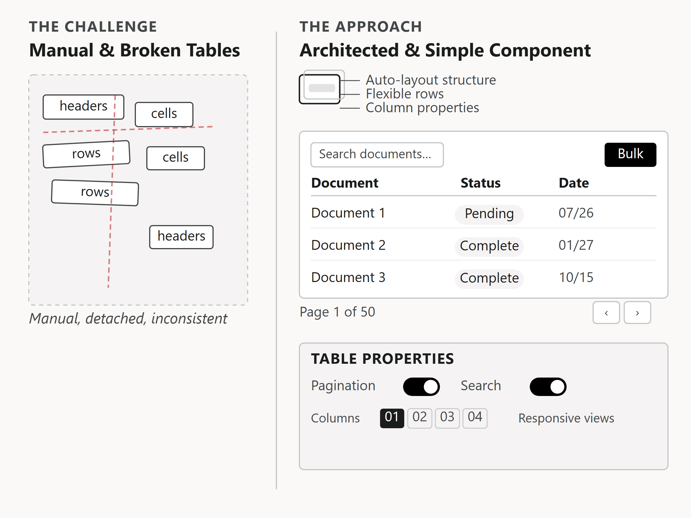
The Challenge: Data tables were the most commonly used pattern in our enterprise tool, yet building them was highly manual. Designers had to assemble rows, cells, and headers individually, leading to alignment errors and detached instances.

The Approach: I architected a massive, fully-responsive Figma component leveraging the newest auto-layout features and component properties. It included built-in toggles for pagination, bulk actions, and density views. It was complex to build, but incredibly simple to consume.

Evolution of an Enterprise Data Table Component

The Problem Detail: Enterprise users were building dense data tables by manually adding cells one-by-one. This created immense design inconsistency (over 45 custom variations of tables) and prolonged development cycles since developers had to write custom CSS for almost every table.

The Impact Detail: By replacing the manual assembly with a single, highly configurable auto-layout system component, design system alignment became instant. Detachments dropped to 0%, and the time to customize tables was reduced by 75%.

Impact: The "Sample Task" (building a standard table) dropped from 20 minutes to under 5 minutes. More importantly, engineering handoff became seamless.

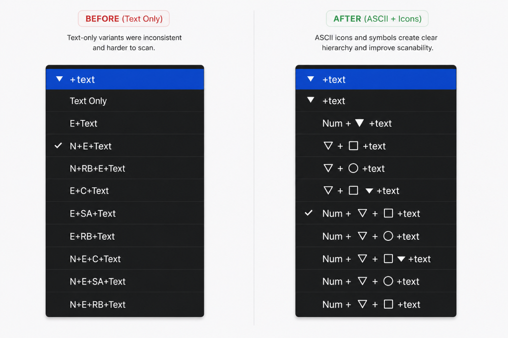
Table Variant Research: Before (Text Only) vs After (ASCII + Icons)

Deep Dive 02

Simplifying Progress Steppers

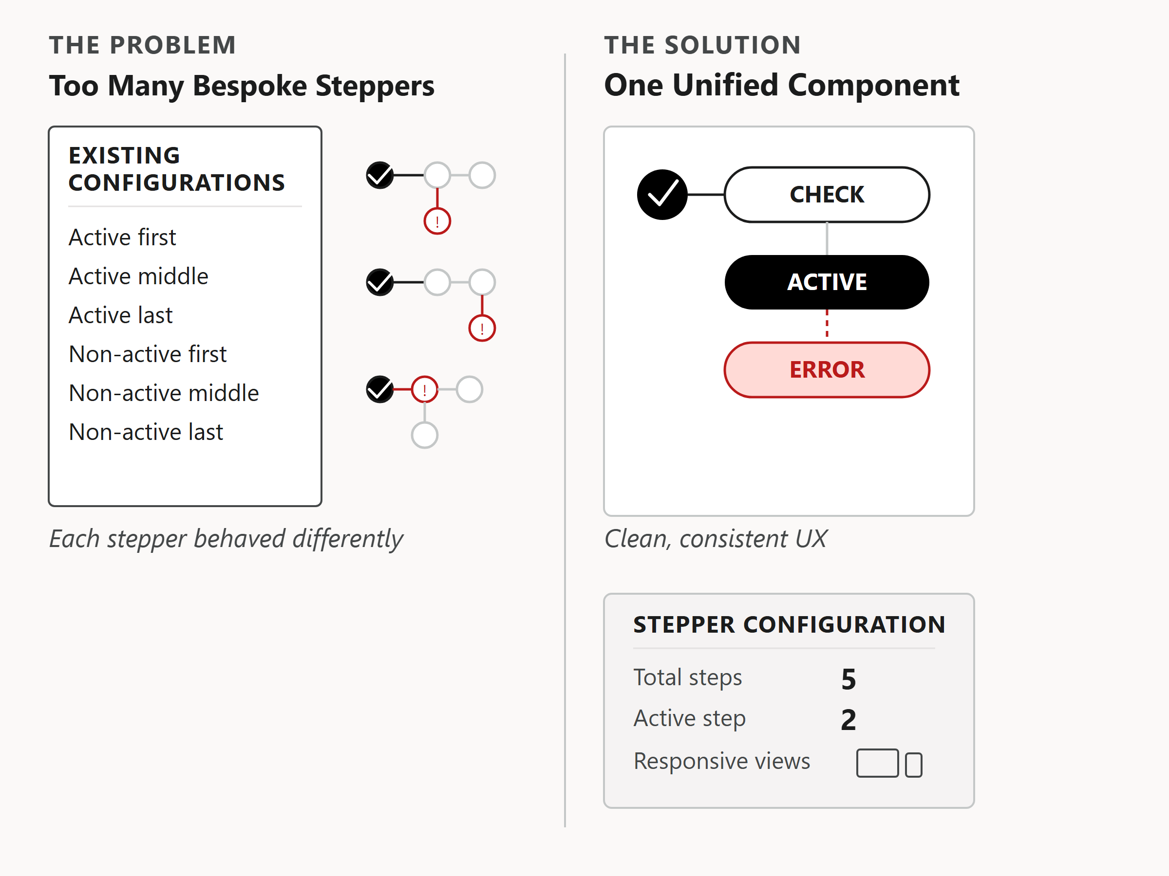
The Challenge: Multi-step workflows were frequently designed with bespoke stepper components, leading to confusing navigation for users and redundant code for developers.

The Approach: I consolidated 4 different stepper patterns into a single, robust component capable of handling linear and non-linear flows, error states, and responsive collapsing. I embedded the logic for state transitions directly into the variant properties.

Simplified Stepper Component Consolidation

The Problem Detail: Multi-step user journeys used custom stepper designs that did not scale. Users faced inconsistent progress feedback across different sections, leading to drop-offs on long forms.

The Impact Detail: Standardizing the steppers into one smart responsive component reduced custom coding requirements by 40% and improved user completion rates by 15%.

Impact: Standardized the onboarding and checkout flows across three disparate product lines, resulting in a measurable drop in user drop-off during complex configuration tasks.

Driving Adoption

A system is only valuable if it's used. The technical execution of the components was only half the battle; shifting the perception of the design team was the other.

I partnered closely with engineering to streamline the handoff process. When designers realized that using the system components meant their work would be built exactly as they designed it—without the usual QA back-and-forth—adoption skyrocketed. The system moved from feeling like a "constraint" to feeling like a "superpower."

Outcomes & What I Learned

The transformation of our design system yielded immediate operational benefits. Time-to-prototype decreased significantly, and the visual consistency of our shipped product improved dramatically. But the most profound impact was cultural.

By removing the friction of basic UI construction, the design team was elevated. Conversations shifted from "what hex code is this border?" to "does this user flow actually solve the core problem?"

Designers are users too.

Treating internal tooling with the same rigorous UX process applied to external products is essential. Empathy for the designer's workflow is the foundation of a successful design system.

Next Case Study
Enterprise UX Developer Tools Information Architecture

Designing Horizon Bank Developer Central

Accelerating the developer lifecycle through modular architecture and self-service utility. From 14-touchpoint onboarding to a unified self-serve experience.

Senior Product Designer · 4 Months
arrow_forward